Rizwan Fruit Corner | Maitri Dalicha
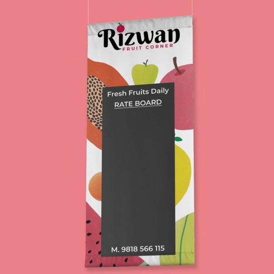
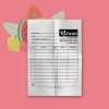
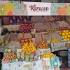
A burst of colours and smells are the very first attributes one experiences when he/she enters a fruit shop. The illustrations are based on the similar experience. A wide spectrum of colours is used to represent the medley of colours one finds at such places. There is a maximum use of pink and its tones since the owner – Rizwan has an affination towards the particular colour. The logo is fairly monochrome in juxtaposition with a large gamut of colours. Hence the entire look and feel of the store is represented as a happy place to be in order to boost consumerism.
