Jamil Green Vegetable Shop | Mehak Mahajan
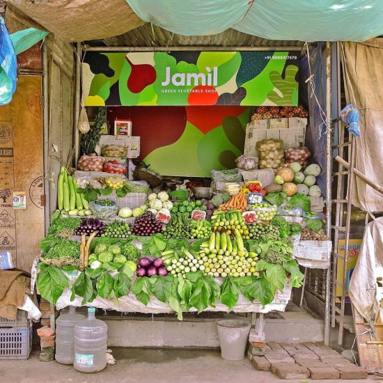
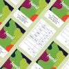
The base design of a dense foliage in flat illustration style draws from all the colours and shapes that come to mind at the thought of a vegetable shop, with a primary overtone of green keeping in mind Jamil’s obsession with the colour as well as as a symbol of the green-consciousness that runs through the collaterals designed for the shop. The logo mirrors the simplicity of the shop’s name. The choice of an easily readable font ensures that it stays true to the ethos of the establishment, while the accent-like leaf continues to carry the ‘green’ story forward.
